Charts from MV – Part 2
Following up on Part 1 of this topic, As I continue working on this I’m quite pleased with the progress. I am providing screenshots, and the code which I’m using for testing – just not the code that actually generates the charts.
So far I’ve been testing bar charts, pies, and line graphs. The samples here were not designed to be end-user quality, but simply to test the various capabilities of the charting tools so far. I’ll work on something more attractive later.
I could be wrong but I think Google charts are fairly basic, not very sexy. Hey, it’s free. If we want something really sexy we can use Telerik RadControls or some other commercial components. Yes, I know about ZedGraph, and there are a hundred other freeware cross-platform libraries. For now I’ll stick with Google and if I really need more sizzle I’ll start looking elsewhere.
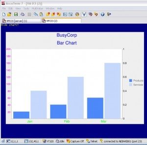
You can click the images below to expand them if you wish. Note that the images are surrounded in the AccuTerm terminal emulator container. What’s happening is that I’m generating codes for the chart itself, calling Google to return an image, then using the ESC:STX programming functionality in AccuTerm to render the image right on the screen. So my development consists of edit, compile, run, just like any MV app, but my output is an image instead of a data entry screen.
This is the Test1 Bar Chart (T1):
 Click here to see the code for GRAPH.BP T1
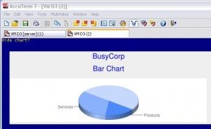
This is the Test2 Pie Chart (T2):
 Click here to see the code for GRAPH.BP T2
You will notice that I copy/pasted the T1 code into T2. Oops, I just noticed the comments in that program still say T1. Oh well, this code is rapidly evolving. I also forgot to change the title. That’s not a problem. I can just change from
GC.DETAIL = “BusyCorp” :@VM: “Bar Chart”
to
GC.DETAIL = “BusyCorp” :@VM: “Pie Chart”
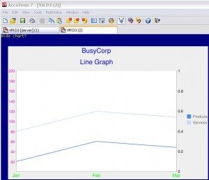
and re-run the program to see the results. Changing the chart type required very little effort. For example, here is a line graph that I think required just a change of one line in T1: GC.DETAIL = C.LINE (Oh, and I fixed the title too):

To answer a few questions about the code:
- All constants are defined in GCHART.INCLUDE. For example, C.INIT, C.TYPE, C.3DPIE, etc.
- Just a few variables are carried around in named common, including GC.PARAM, GC.DETAIL, and GC.INITIALIZED.
- Each facet of a chart is managed with a consistent pattern: Set GC.PARAM with an indicator of what is being done, set GC.DETAIL with details for that action, then call GCHART to load the parameters into a working definition.
- Note from the code comments that I’m using the Google documentation as an ongoing reference. In fact, with each new feature, I have the Google page open, then I create the constants for a new function, then I implement the functionality in GCHART, then I write the test code to exercise the functionality, then I just execute it to see what happened. This is fairly rapid development.
- At the very bottom I use the C.RENDER instruction to tell GCHART to go get a new image from Google. Then, for these samples, I call a program called SHOW.CHART.1 which renders the image in AccuTerm. For other purposes I might move the image to a website so that I could reference it in HTML, whether in a web page or in an HTML email.
That’s it for now. Over time I will add more details to improve the overall look of the charts, and I will support more chart types like Venn diagrams, Candlestick and Box charts, and Scatter diagrams. I’ll blog more about this as time permits. I really want to focus on getting the bar, pie, and line charts looking nice so that I can use them in current projects.
Here are distribution models that I’m still considering:
- for-sale closed-source
- open source freeware (not high on my preferred list)
- for-sale with source provided under a license that prohibits distribution (typical MV app licensing)
- open source freeware with mandatory support (model used by RedHat and many other companies)
- open source freeware with optional support – software is free but help and updates are not, at least not from me
… I really don’t know how this one is going to work yet.
Suggestions are welcome.
2 thoughts on “Charts from MV – Part 2”
Leave a Reply
You must be logged in to post a comment.
[…] « Visual Studio Server Explorer, MV Datasources | Charts from MV – Part 2 » […]
It occurs to me that I’ve already written a blog on charting related to DesignBais. That article talks about some of the other platforms that can be used besides Google Charts (which didn’t exist when I wrote that other blog). DesignBais users may be interested in this new blog series, and people interested in charts may be interested in the older, but still applicable blog.
http://nebula-rnd.com/blog/general/2006/08/dbtip-graphs1.html